


Before & after. Real redesigns.
Five website redesigns: two live launches and three concepts. Drag each slider to compare the original site with the redesign.
SPUNKY
Kids' clothing brand · founder Myesha
 BeforeAfter
The challenge
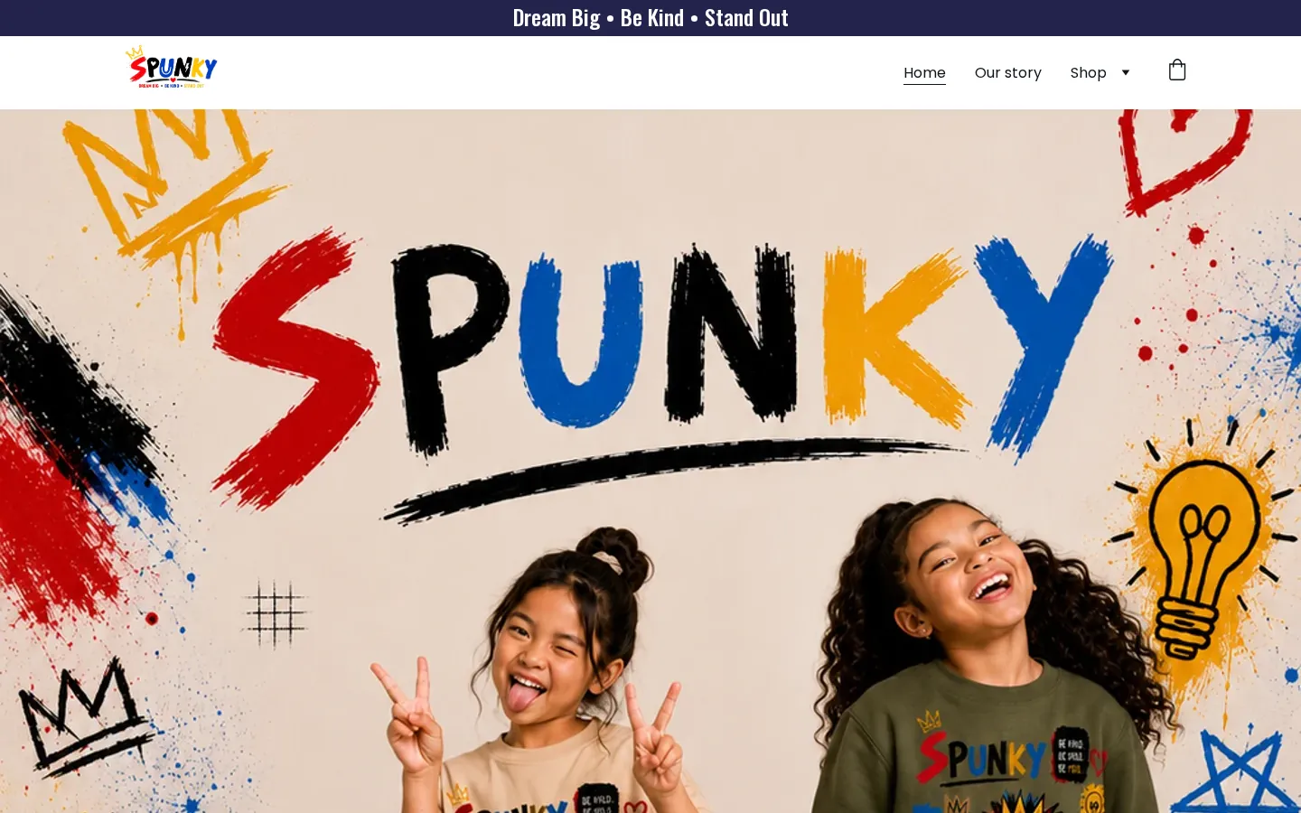
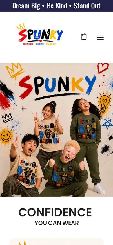
SPUNKY's original Website Builder template opened on one large photo with no headline, value line or Shop button, and the brand line was baked into an image. Below it, all 20 products ran in one long grid (on a phone, roughly 16 screens of scrolling) before visitors reached the story, the SPUNKY Crew or the return policy.
What we changed
- Replaced the builder template with a custom-coded site: home, shop and Our Story pages.
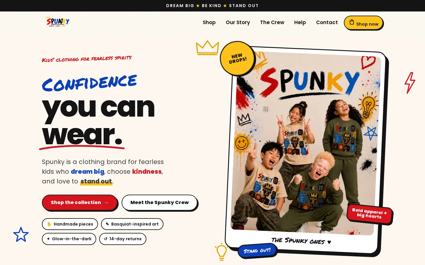
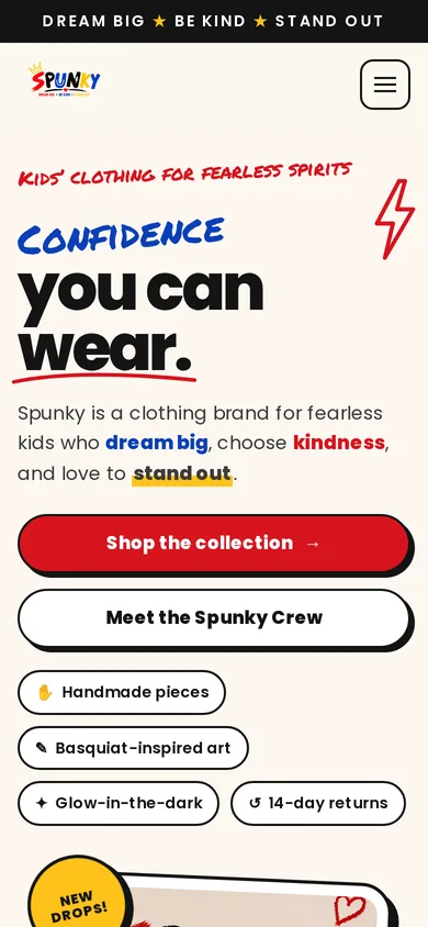
- Led with her real line, “Confidence you can wear,” as live text, with Shop the collection and Meet the Spunky Crew buttons.
- Moved trust points to the top: handmade pieces, Basquiat-inspired art, glow-in-the-dark, 14-day returns.
- Kept the existing store running on shop.spunkyones.com, so products and checkout stay where they were.
- Compressed WebP images and descriptive alt text throughout.
How it helps
Shoppers see what SPUNKY is and where to buy in the first screen, on any device. The brand's story and characters now lead the site instead of hiding at the bottom, and keeping the store on its own subdomain means checkout and orders run on the same system as before.
Results will be added as they're measured.
Mobile, 390px wide
Flex Fuel
Credit & business-funding company · Kenny's own brand

 BeforeAfter
The challenge
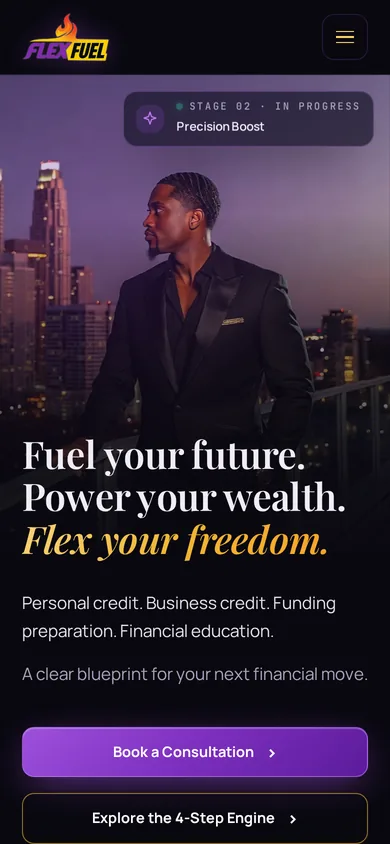
The previous flexfuelpro.com, built on GoHighLevel, opened with a heavy bold headline that ran past the first screen, two competing neon buttons (Book a Consultation and Sign Up For $0 Today) and a small stacked Client Login link. The purple-and-orange neon look read more like a promotion than a trusted financial advisor, and on mobile the logo and buttons stacked up before any message appeared.
What we changed
- Replaced the GoHighLevel site with a custom-coded site, launched on flexfuelpro.com and hosted on Hostinger.
- A premium purple-and-gold design with a cinematic portrait hero, an elegant serif headline (“Fuel your future. Power your wealth. Flex your freedom.”) and smooth scroll motion throughout.
- One clear booking path: every Book a Consultation button opens the same custom luxury calendar, with open times shown right on the page.
- Sections for the 4-Step Engine, client goals, the Credit Builder Card and the 90-day guarantee in the company's own terms, plus a Flex Dashboard card clearly labeled as an illustrative sample.
- An e-book funnel for Credit Mastery by Kenny Garrett, with its own page at flexfuelpro.com/ebook.
How it helps
A credit and funding brand runs on trust. The new site presents Flex Fuel as an established advisory firm, gives visitors one obvious next step with a calendar that opens without leaving the page, and keeps the copy careful, with no score or funding promises.
Live since Oct 6, 2026. Results will be added as they're measured.

Mobile, 390px wide
Masculine And Natural
Barbering & grooming products by Maurice Pope · Cumberland Mall, Atlanta
 BeforeAfter
The challenge
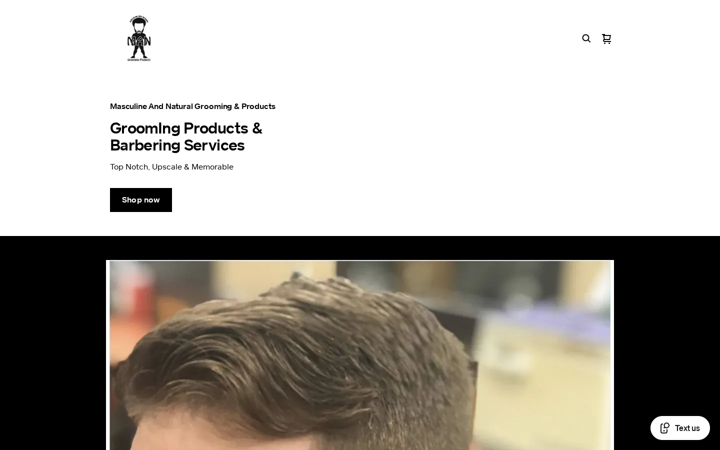
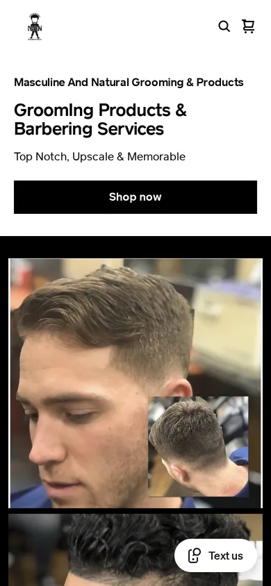
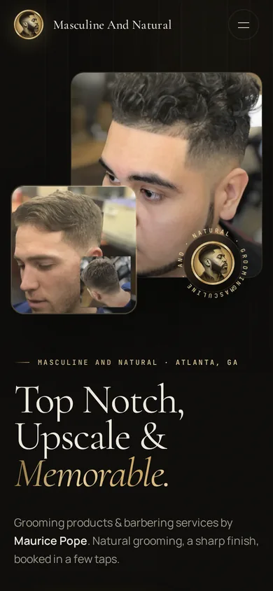
Maurice’s Square Online site carried the platform’s default “My Site” name in the browser tab, and its shop page showed “Items aren’t available for sale yet.” His booking page listed Square’s sample “Consultation (example service)” and internal “Block Time” entries next to his real services, and the main heading read “GroomIng” with a capital I. The barbering behind it deserved a site that looked as sharp as the cuts.
What we changed
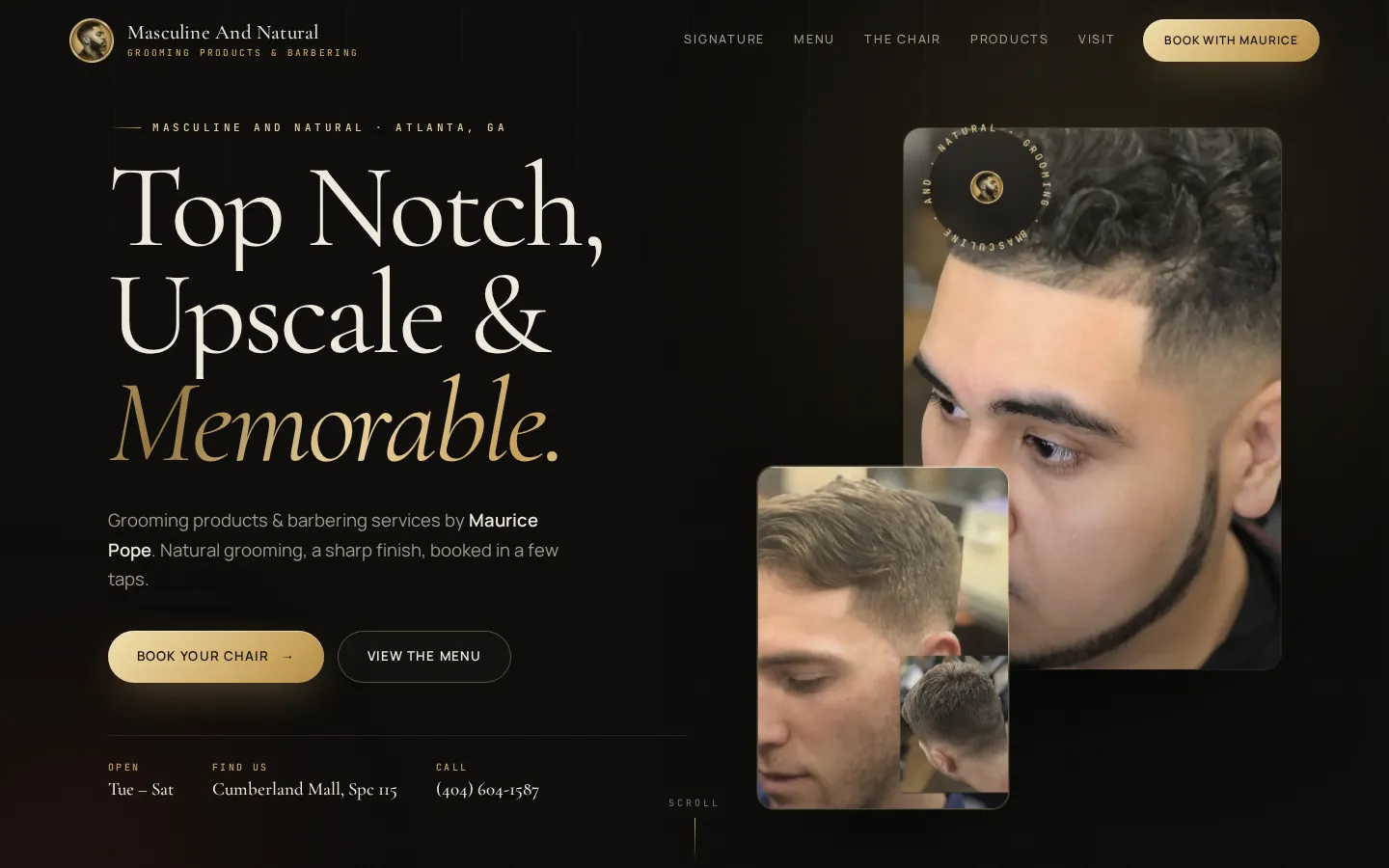
- A luxury black-and-gold design with motion, built around his Masculine And Natural (M.A.N.) logo and his own line, “Top Notch, Upscale & Memorable.”
- All 20 of his real services with prices, grouped into a clear menu (cuts, combos, shave & beard, lines & detail, face & color, 12 & under).
- His real hours (Tuesday to Saturday) and location at Cumberland Mall, with his phone number up front.
- A luxury booking calendar: clients pick a service and a time, then are handed off to his Square booking for that exact service, so appointments stay in the system he already uses.
- Sample services, internal time blocks and the heading typo left out.
How it helps
Clients can see who Maurice is, what each service costs and when he’s in the chair, then book in a few taps, while every appointment still lands in his existing Square calendar.
Concept only. Not yet approved or live. Results will be added as they're measured.
Mobile, 390px wide
AURĒ
Luxury lip care for dental practices · findaure.com
 BeforeAfter
The challenge
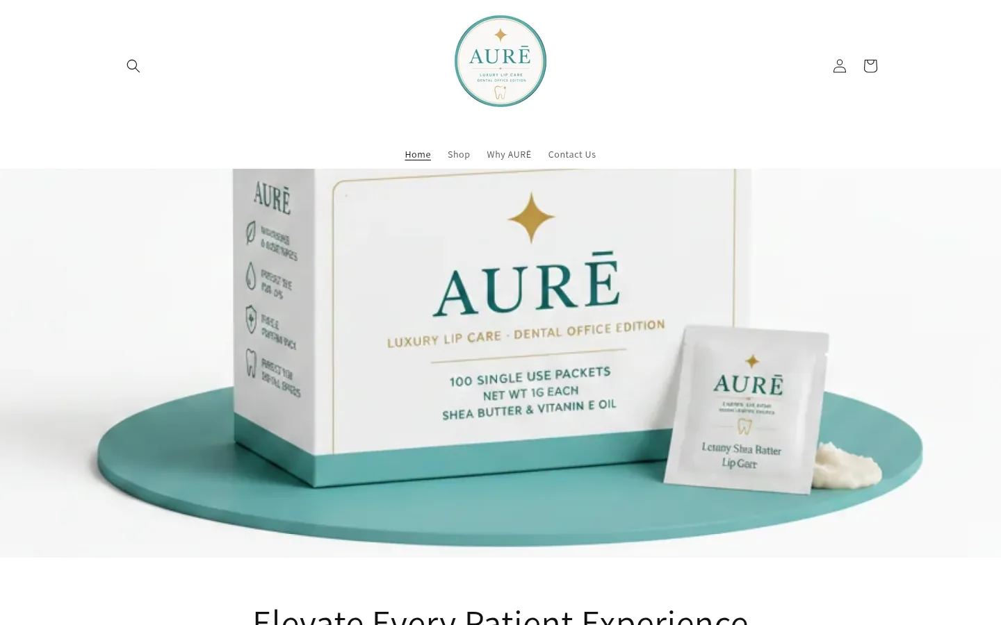
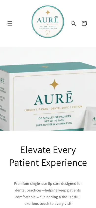
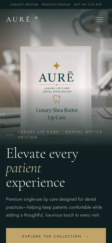
AURĒ sells premium single-use lip balm packets to dental offices, but the site ran on a stock Shopify theme: default sans type, small centered navigation, and a hero photo with no headline or button. The homepage didn't show the three boxes or their prices, the promo's box name didn't match the shop, and the one testimonial sat on a secondary page.
What we changed
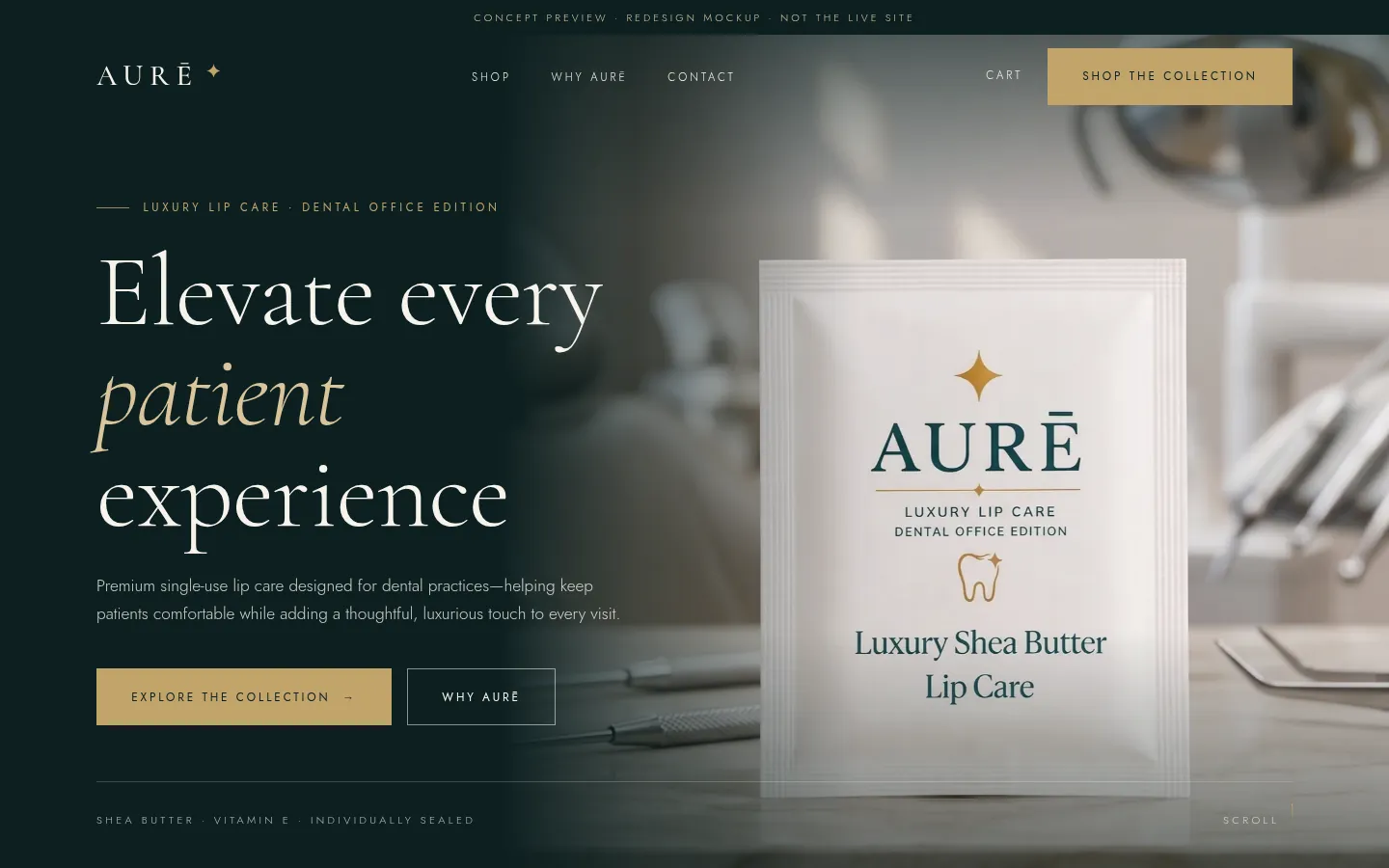
- A deep ink-teal and champagne-gold palette taken from the packaging, with an elegant serif type system.
- A first screen that explains itself: “Elevate every patient experience,” a one-line description and an Explore the collection button.
- Clinical-setting photography that shows the packet where it's used.
- The three boxes (Discovery, Signature and Reserve) on the homepage with packet counts and prices.
- Benefits, ingredients and the RDH testimonial brought forward, plus refreshed Shop, Why AURĒ and Contact pages.
How it helps
Practice managers can see what AURĒ is, what each box costs and why it's worth it without clicking around, and the website now looks as premium as the product in their hands.
Concept only. Results will be added as they're measured.
Mobile, 390px wide
Straight Request
Professional salon hair care since 1993 · Orlando, FL
 BeforeAfter
The challenge
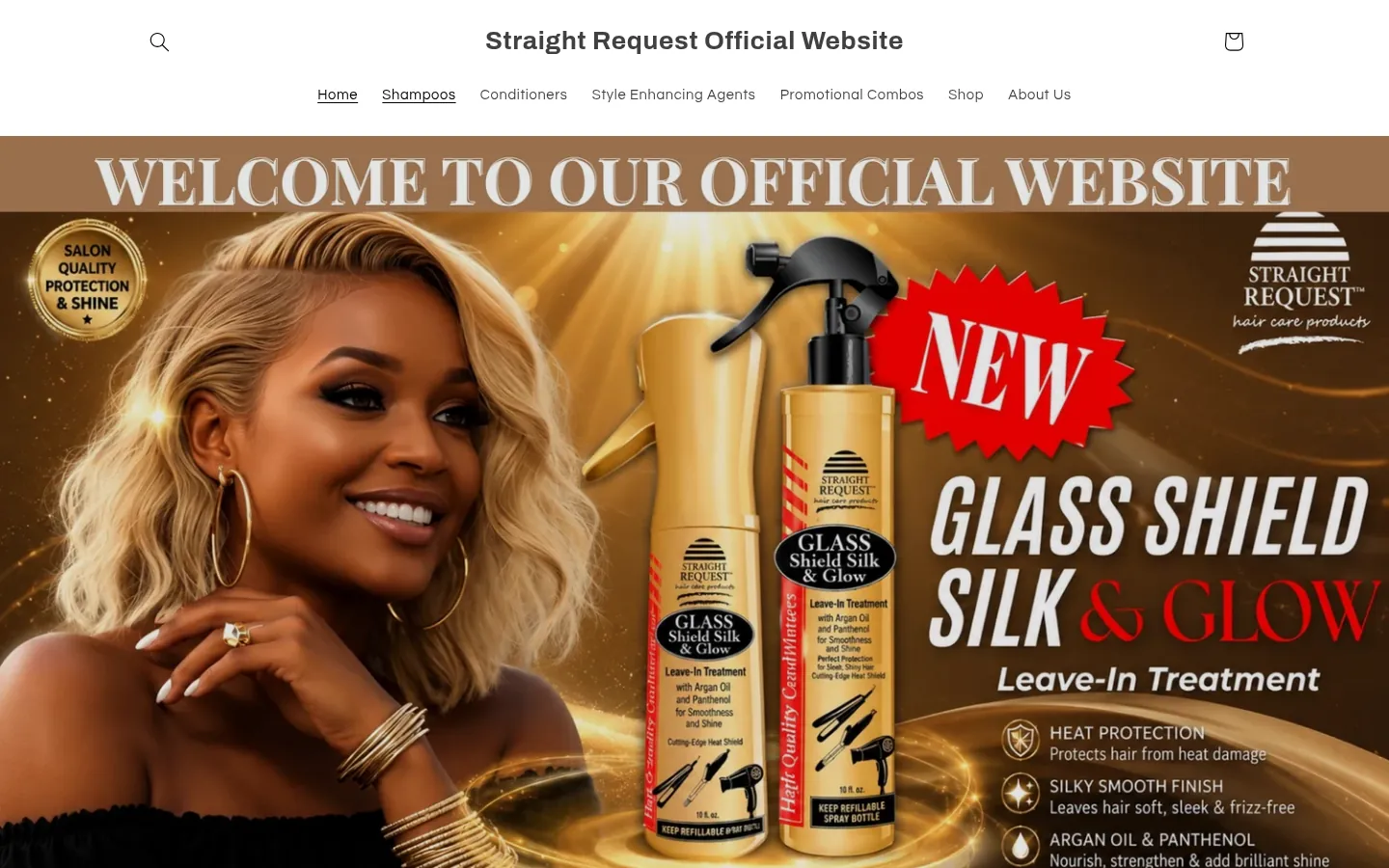
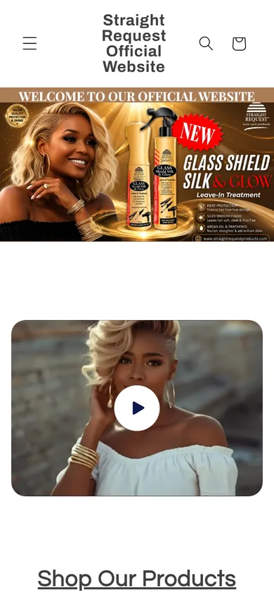
Straight Request is a salon brand with three decades behind it, but its Shopify store showed a plain-text title (“Straight Request Official Website”) instead of its gold logo, and a flat hero banner with “Welcome to our official website” baked into the image. Several menu links went to the wrong place (Shampoos opened the home page, Shop opened an empty collection), there was no Contact page, and when we reviewed it on Oct 4, 2026 the main domain was returning a security (SSL) error.
What we changed
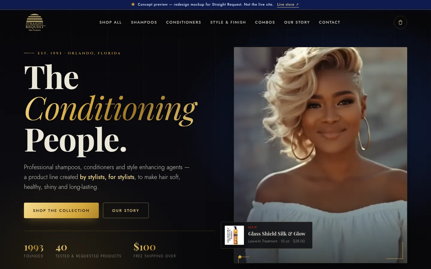
- A cinematic dark-and-gold hero built on the brand's own colors, with “The Conditioning People.” set in a regal serif.
- The real gold logo in the header and clear navigation: Shop all, Shampoos, Conditioners, Style & Finish, Combos, Our story, Contact.
- A shop page with all 51 unique products in clear groups, with filter chips.
- Product cards with category, benefit copy, sizes, real prices and links to the real product pages.
- A heritage timeline, a 3-Step Detox feature, About and Contact pages, and a written fix for the domain issue.
How it helps
Stylists and shoppers can find the right product by category in a couple of taps, and the site now carries the authority of a line made by stylists, for stylists, since 1993.
Concept only. Results will be added as they're measured.
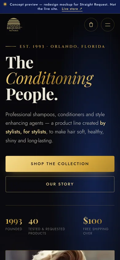
Mobile, 390px wide
 Let’s talk
Ready to build the business behind the vision?
Tell us where you are and where you want to go. Pick a time on our calendar and let’s talk it through.
Book a consultation →